Monday, December 19, 2011

Beowulf: An Epic Retelling

Sam, Austin, Jaehoon

Gareth Hinds retells the epic tale of Beowulf’s adventures in a novel way with his graphic novel, Beowulf published in 1999. For anyone who has read the epic poem, the story is nothing new; the brave, super-human Beowulf shows up to Denmark promising to save the day from the evil Grendel, boasts a bit in the great hall before he does, and then kills both Grendel and his mother. All of this makes him extremely rich and famous, so much so that he becomes a nobleman, and through the death of every single other noble in the country during a war, becomes the king. For fifty years, everything is peaceful, until someone angers a dragon while stealing from its treasure horde. The dragon then begins to ravage Beowulf’s Kingdom and Beowulf defeats it in his final battle. Critiquing the story itself would be unfair, as it is not Gareth Hinds’ in the first place; he is simply telling it through a different medium. It is therefore necessary to examine and analyze the methods and techniques used to tell it.

One of the advantages graphic novels have over other print media is the availability of the image to convey emotions, mood, and smaller details more subtly than written work often does. Different colors or shading can make a scene feel ominous, hopeful, happy, or a variety of other feelings. Gareth Hinds uses this throughout the novel very well, conveying emotions and feelings of bleakness, danger, fear, and weariness through the tones and colors of the panels. In the first “book” of his adaptation, his fight between Beowulf and Grendel, the colors are the most saturated, and the whole battle is tinted red. At this point, Beowulf is young, and eager for battle, which he seems to get a sort of high from. The red tint of the pages with the battle heightened the tension, and made the scene more exciting as a whole. On the other hand, the second battle seemed much darker and frightening. By the time the battle is over, the color is fading, which makes Beowulf seem worn. The third and final book, which contains the battle with the dragon, is painted in gray-scale, which enhances the worn out, tired feel of Beowulf. Hinds’ use of color and tone adds depth to work and the story as a whole.

Another major part of Hinds’ work was the layout he used throughout the novel. As with the color and shading, he varied them between the three books. The first book was somewhat disorganized at some points, such as the boasts of the sea monsters. However, it was still easy to tell what was going on. The second book, on the other hand, was very disorganized and difficult to comprehend sometimes. This stark difference between the two helped to show the difference in how Beowulf felt. He goes from the confident hero to a worried man who was fighting out of necessity. In the final book, when Beowulf confronts the Dragon, everything is very orderly, including the battle. This is in contrast to the first two fights, which shows some sort of emotion or rush during conflict. Beowulf does not seem care about, enjoy, or experience any sort of emotion in his encounter with the Dragon. It is as though he has grown weary of battle and ruling his kingdom, and his duties are more of a burden than anything else. While Hinds does not depict emotion in Beowulf directly, how his organizes the panels in the novel forces the reader to experience certain emotions. These emotions in turn help the reader understand the emotions that Beowulf was experiencing. This use of the layout by Hinds’ added a definite layer of depth to his adaptation of Beowulf, which greatly improved the story.

Gareth Hinds’ graphic novel took a story which has been told time and time again through various media, and still managed to make it a new experience. His use of color and tone set the novel apart from other retellings of Beowulf, by conveying emotions that were not otherwise shown. Moreover, his manipulation of the work’s layout provided a deeper sense of this emotion without directly showing it, in a way that only graphic novels can. He has shown an understanding of the medium through which he writes, and will hopefully continue to produce works of parallel, or even greater, quality.

Kingdom Hearts: An Unreadable Farce

Kingdom Hearts is the manga companion to the critically-acclaimed video game by Square Enix. The story begins with Sora and his two friends, Riku and Kairi in their homeworld. However, as his world is destroyed by shadow creatures called the “Heartless,” Sora loses his friends and is thrust into another world, where he meets Donald Duck, the magician, and Sir Goofy, the knight. The two Disney characters notice that Sora is holding a keyblade, a fabled weapon that has the power to seal worlds from darkness. After being attacked by the Heartless, the three travel to different Disney Universes (e.g. Alice’s Wonderland, Aladdin’s Agrabah) to search for Riku, Kairi, and King Mickey Mouse. Along the way, they realize that they must use the keyblade to save the universe from darkness. In each of the Disney worlds, Sora locks a “keyhole” that seals away some of the darkness and in the end, with the help King Mickey, manage to completely lock away Kingdom Hearts, the source of all darkness.

Yeah, sure, maybe the plot sounds kind of cute, but that’s about all this manga offers. Kingdom Hearts is a poorly-created manga in so many different ways. To begin, the above summary is about as clear a telling of the story as the actual manga is. From the very first panel, the reader is confused. The introduction is ambiguous and suffices only to supply the names of the three friends Sora, Kairi, and Riku. The manga then jerks to a different setting, a scene of a distraught Donald Duck and Goofy after learning King Mickey has disappeared. To add to the confusion, the story then jumps again to Sora, who is now in a completely new location, with no explanation of how he arrived there. These jumps make closure difficult, because, one, the reader has to spend time thinking about what happened between the panels, and two, because the closure that the reader experiences may be ambiguous.
These discontinuities make the manga hard to follow, and thus, it obscures any small details that the author may have wanted to present to the reader. However, even after closely reviewing the panels, we still could not understand much of what happens in the story. There are simply gaps in knowledge. For example, how the keyholes work is never explained and Mickey’s role is never properly elucidated.

These gaps in knowledge are frustrating, because as more and more information is missing, the story gets more and more confusing. However, another problem that results from these gaps is that most of the occurrences seem like silly deus ex machina. None of the events are believable because, in short, we only see the effects and not the causes, and so the reader is not drawn into the story. The most garish example of deus ex machine occurs at the end when Kairi miraculously manages to save Sora just “by the power of her love,” and everything ends, like a Disney story, “happily ever after,” giving Kingdom Hearts a childish nature. This would not necessarily be a problem, given that it could be a children’s story, but the violence and shounen manga style make it seem directed at a teenage audience. That said, Kingdom Hearts lacks other traditional elements of an engaging manga. In manga, we usually see complex plots that keep the reader on his toes. This story, however, is almost completely linear. There are no plot twists and the reader basically only follows Sora and his Disney posse, only seeing Riku every few chapters. Another missing element is the deep character development that makes manga readers grow close to the characters. The only emotions we ever see are surprise and, sometimes, longing for missing friends. Moreover, there is rarely any introspection: the whole story is a bland narrative of what happens on Sora’s journey.

Besides the fact that it is just a poor story, Kingdom Hearts seems farcical in a number of ways. For one thing, the combination of stern manga characters and silly Disney ones makes the story hard to take seriously. No action scenes can be intense when Goofy is in the panel, no mysteries can be suspenseful when it is Donald Duck who is gasping. There are also myriad other details that make this story ridiculous. For example, the ship on which Sora travels is “powered by smiles,” hearts are the source of darkness, and people turn into little black creatures when they lose their hearts.

Unarguably, the story is poorly created. As for visual elements, however, the drawings are competent and manage to supplement the text effectively. The manga is drawn in the style of typical shounen manga, utilizing lines to communicate sound, raised hair to show surprise, and stark contrasts in shading to depict dramatic lighting effects. Moreover, the characters (not including the Disney ones) are drawn in the Japanese style, with large eyes and dilated pupils.

In conclusion, Kingdom Hearts is an awful manga, if you can even call it that. It lacks the elements that make a manga engaging. It is even read from left-to-right, which can actually be frustrating to the seasoned manga reader who traditionally reads right-to-left. However, it is not the untraditional approach of this manga that makes it bad. The most fatal flaw is how jumpy it is, never giving the reader enough information for closure, never filling the gaps in the story. Even if Kingdom Hearts did have an interesting plot, the reader would never know.

Amano, Shiro. Kingdom Hearts. Mangabit.com n.d. Web. 17 Dec. 2011.
‒ ‒
James Chen
Yang-Yang Feng
Gus Nelson
Karthik Yarlagadda

Beowulf the Graphic Novel by Gareth Hinds

In the city of Denmark, there was a hall in which the king and his men were being tormented by a monster named Grendel. The king called upon Beowulf from across the land to help rid the soldiers and the village from Grendel. Once he arrived, he told of how he defeated an octopus and how he was more than capable of defeating Grendel alone. Once in the battle with Grendel, he tore off his arm and hung it up for the whole hall. Eventually Grendel’s mother came to avenge her son and Beowulf went to fight her and ended up killing her and her son. Later the king of the Beowulf’s homeland died and Beowulf became the king of everything. He ruled peacefully and then one day a beggar was walking and saw a goblet in the cave of a dragon, which he took. The dragon was upset and began to terrorize the people. Beowulf faced the dragon and was fatally wounded by him. He killed the dragon and died after saying his last speech.

Beowulf is the protagonist in this comic. He fights Grendel, Grendel's mother and a fire-breathing dragon. Beowulf is the strongest and most capable warrior around. In his youth, he personifies a perfect hero. In his old age, he proves to be a wise and effective ruler.
Grendel is a monster that preys on Hrothgar's warriors in the king’s mead-hall. In the novel, Grendel represents the first challenge that Beowulf must get over. It is almost like Beowulf first proves himself to the rest of the men by beating Grendel.
Grendel’s mother is more monstrous than her son having less human qualities and avenges her son. Beowulf found Grendel’s mother to be another challenge in the book. Once she died, he was officially able to kill Grendel because she was the protector of Grendel.

The epic poem is split into three books in which each book has its own artistic style. In the first book, Hinds uses a type of parchment paper as a backdrop to his drawings. This style was evident to us when we described page 7 as: old style, watermarked, and clean. Parchment paper is made from cleaned animal skin which made it smooth to write on which would explain the preciseness of the drawings. It is also noted that in this book, the drawings that take place in the banquet hall have an ink blot effect in the style.

In book two, Hinds uses wood the same way he used parchment in the previous section. The reader notices this change because of the streaks that line the page and also the knots across the pages that also appear in chopped wood planks. On page 29, the wood is seen most as the circular streaks span across the page.

The last book in the poem, the page style changes to that of old newspapers. The gutters of the pages are white with old watermark stains in the corners. One can hypothesize that this style of the book symbolizes the fact that Beowulf has grown older.

As this poem is divided into three parts, they serve as the beginning, middle, and end. The structure of this seems to be heavily reliant on graphic elements, rather than textual. The most interesting part of this structure is that at the climax of this graphic novel, there was absolutely no text involved, just a unique use of color, closure, and slant panels. It is even more credit to Hinds for successfully capturing all of the anticipated gore vividness of these scenes without using a single line of text beside the onomatopoeia, of course.

In this interpretation of Beowulf, Gareth Hinds is able to effectively use visual contents to exemplify the telling of the epic poem. Ranging from white to black and from red to blue, a wide variety of color hues along with shading were utilized to help with the emotions of the book. Tones of red were used during the battle between Beowulf and Grendel’s mom to help the reader feel the intense moments, Grayscale panels help to show that in book three Beowulf is an old king and how the battle with the dragon leads to his death. Color also helps the reader know that things like the black blood come from or are caused by a monster or something not human-like. Likewise, a circular radiating background around Beowulf during several fighting scenes seems to emphasize his heroism. The reoccurring constellation background in book one helps to set the time in which the story takes place; a time where the constellations were very bright as pollution and man-made light didn’t hinder their viewing. In the time of Beowulf, constellations were a big part of life helping with traveling and to know the time of the year. Hinds’ use of blending onomatopoeia really adds to the action and stimulates the reader’s sense of sound like the three dimensional boom when Beowulf enters Heorot Hall for the first time. The visual elements: the shading, the color, the background and the blending onomatopoeia really become a big part of this graphic novel; bringing it to life and making the epic poem Beowulf, a true joy in reading.

As this graphic novel follows the original epic poem, the themes between the two seem to be synonymous. The fact is all great things come to an end. Beowulf’s rise, peak, and fall accurately portray and bring to life this saying. The graphic novel puts a face to this saying as well, so the emotion for the reader is intensified. For example, in the beginning of the book, he is shown as this high and mighty individual who is capable of defeating any foe. As the book progresses, he proves that he is above all by slaying both Grendel and his mother. After his peak, he begins to decline as portrayed in his last battle with the dragon. His reign tragically comes to an end, but an end nonetheless.

Beowulf Review (Butcher, Rasmussen, Pitaktong)

Seth Butcher, Matthew Rasmussen, Areen Pitaktong

Beowulf Review

Hinds: Another Malicious Christian Monk

Gareth Hinds’ graphic novel adaptation of the legendary story of Beowulf strives to both remain faithful to the heroic spirit of the original, while adding both greater depth and excitement through its visuals. In many ways, this adaptation succeeds, but the illustrations are often incorrect or seem out of place, distracting from the story of Beowulf.
Beowulf the character towers over his fellow men, but is no match in size for the horrific Grendel. In order to show how Beowulf manages to defeat his massive adversary, Hinds draws on his own personal knowledge of martial arts. Hinds depicts Beowulf employing various arm bars and throws. These moves come from martial arts traditions that would not have been known in Northern Europe in the time of the tale. Hinds turns Beowulf contest of sheer strength with Grendel into one where he uses skill to defeat his enemy, changing the emphasis of Beowulf’s talents from raw, heroic strength into skills perfected through practice.
The original story of Beowulf was an older, pagan tale transcribed by a Christian monk. The monk’s Christianity warped the story, and Hinds adds even more references to it, further distancing the adaptation from the original story. For instance, in book two, Beowulf emerges from the lake after defeating Grendel’s mother, holding a sword with an destroyed blade over his head like a crucifix, with light illuminating the Christian symbol. Still, Hinds adds a call back to the bloody, non-Christian origin of the story: in the spread, Beowulf also clutches Grendel’s mother’s severed head in his teeth by its hair.
The graphic novel rendition of the great epic offers little new content besides pretty pictures. Given that the entirety of the text was already prepared for Hinds, his primary and only task was to illustrate the book and hopefully add in accurate details overlooked in the text. Instead, he deepens the rift between the original tale and the modern adaptation by driving more inappropriate Christian icons into a pagan work. Hinds makes a few decent additions, such as constellations seen in every night sky panel, which demonstrate the importance of astrology to the Danes, who could not otherwise sail, but preferred to add content that is untrue to the original tale.
The clothing style illustrated in Hind’s rendition of Beowulf is one key example of an area that Hinds could have incorporated a great deal of detail, but chose not to. While the use of brooches and tunic-style clothing is appropriate for medieval Geatland, the similarities between the graphic novel and historical fact are limited to these few instances. Among the important articles of clothing for Danes would be leather belts, fur hats that in no way involved horns, and Amber, which was considered to be the most precious item, for clothing, medicine, or even magic, during the age. While Hinds does not use any blatantly wrong pieces of clothing besides the horned helmets, his illustrations could have incorporated significantly more zeitgeist appropriate content.
Finally, the text that Hinds uses is a rework of one of the two original Beowulf texts to ever be recovered, but the voice in which the story is told is drastically different than any translation of the original text, which gives Beowulf a completely new persona. In the original Beowulf text, the protagonist is responsible for a majority of the narration. Beowulf the character frequently boosts about his achievements and seems to ooze confidence. Hinds’ Beowulf does not exhibit nearly the quality of the original Beowulf’s persona. When we are introduced to Beowulf in the graphic novel, we are introduced to a tall Nord with little to say. The hero only speaks when discussing his intentions which, due to the medium, could not be effectively communicated. The primary reason for Beowulf’s journey is for self-glorification, which Hinds seems to have overlooked. Beowulf essentially became a silent, noble hero, which is absurd given the motivations and goals that are so clearly displayed in the original text.
Hinds did not add a great deal of detail to Beowulf through his graphic novel adaptation, and instead preferred to add ridiculous content that is not plausible nor realistic. While graphic novels add the option to illustrate a story and show detail too extraneous for text, Hinds did not add any relevant detail, and instead chose to restrain the reader’s imagery of Beowulf to his own interpretation as opposed to adding in relevant detail that could add to the epic. Just like how a Christian monk was the first to record the tale of Beowulf and in doing so infused the story with large amounts of Christian symbolism, Hinds chose to add inappropriate content such as horned helmets and martial arts into an otherwise great piece of literature.

Blankets

Blankets, by Craig Thompson, describes first love, family, and growing up, and is loosely based on the author’s own life. Craig meets Raina, a girl from Christian camp, who encourages him to explore his spirituality and question what he had thought he knew about his life and his faith. Their relationship grows as they send drawings, poems, and letters back and forth. Eventually, Craig travels from his small, fundamentalist town in Wisconsin to Raina’s house in Michigan, where she deals with a myriad of problems stemming from a family that’s falling apart. While her parents struggle with their divorce, Raina helps care for her two adopted siblings, both with mental disabilities, and her niece, Sarah, whose parents are disinterested. When Craig arrives, he finds himself in the middle of Raina’s struggling family. Intertwined with his story of first love are descriptions and memories of the relationship Craig shares with his brother. Among these recollections, he brings the reader to the nights when they were young and shared the same bed, where many fights would erupt and their parents would come to scold them. Blankets is a fascinating story that captivates and enchants the reader with wholesome emotions and astonishing intimacy.

Thompson creatively combines text and and picture to create an idyllic coming-of-age story. At first glance, the reader may be flustered by the large 592 page graphic novel, but as the first couple pages go by, it is quite obvious that the story is a fast read. One main aspect of this novel was Craig’s spiritual journey. He has difficulty understanding the beliefs that he grew up with and he becomes even more confused after spending two weeks with Raina. He was encourages during his teenage years to continue on a path into ministry but there was always something that pulled him in another direction--drawing. Thompson’s work appears fluid and effortless as he captures the emotions of the main characters easily. He also uses blankets throughout his novel as a symbolic object. Blankets come up multiple times: during flashbacks with his brother, other times when Craig is with Raina, and at the end of the novel when he is reflecting on his relationship with her. They symbolise protection, a safeguard from an outside world and create a connection between the younger Craig and one growing up. The reader can easily relate to being underneath a blanket and feeling protected from the world. Whether in a world of happiness or extreme sadness, a blanket’s warmth and comfort provides shelter from these emotions.

Relationships with friends and family are what drives Thompson’s graphic novel, and although some fall apart during the story, he works to strengthen them in the end. One major relationship, besides with Raina, is Craig’s connection with his brother. Craig grows apart from his brother as he goes through his teenage years, and Raina points out this unfortunate fact when they are talking one day. He takes Raina’s suggestion to work on renewing their bond, so that they can be as close as they once were. After he ends things with Raina, he never manages to rekindle things with her, but when he uses the blanket she gave him once more, it does help him not heal the break, but aid complete his own recovery.

Thompson’s graphic novel Blankets is an emotional story that appeals to the reader and uses symbolism and key relationships to drive the story. In it, Thompson captures the essence of first love and growing up, creating a story that will captivate all readers.

The Importance of Friendship: A Review of Kingdom Hearts

Shiro Amano’s bestselling manga, Kingdom Hearts, takes a second look at its critically acclaimed predecessor, the Kingdom Hearts video game by Square Enix. However, unlike most other mangas, this work remains true to is counterpart, including a near-replication of its story line, but what truly makes this work unique is the fact that the manga is based on the video game, breaking the traditional role of video games being an adaptation of a book or movie.

Both the original video game and the graphic novel take part on an amalgamation of worlds that are mostly derivatives of the familiar settings of popular Disney franchises as well as a few developed exclusively by Square Enix. Sora, the amiable, sunny protagonist, begins on his native Destiny Island with his two best friends, Riku and Kairi. A devastating attack on the Island by a mysterious force called the “heartless” separates the friends among worlds they never believed 
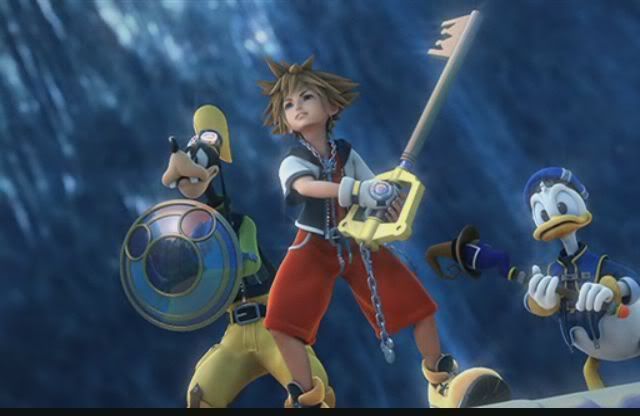
The trio travel among the new worlds, searching for Sora’s friends and the King, along the way learning more about the ominous goals of the Heartless and the notorious Disney villains who plan to take control of it. At the manga’s gripping conclusion, Sora finds both Riku and Kairi, but in moments lost them yet again. The King also remains at large, and the bewildered three companions must wait until the sequel to continue their search into even newer worlds.

However, there are many stark differences between the two works, even at a surface level, the most evident being the artwork itself. While they are both of Japanese origin, the game sought to satisfy a worldwide audience, while the manga was written only with the Japanese audience in mind. Sora is asked to respect the pseudo-Shogunate traditions of Mickey’s Kingdom in the graphic novel; in the graphic novel but not in the initial video game, he is asked to take off his shoes before entering the “Gummi” spaceship that travels between the worlds. Fighting scenes in the graphic novel are also stylized more in the vein of Japanese manga rather than Western superhero comics, which are the inspiration for the battle sequences in the video game. Most notably, the manga stresses the importance of the face, enlarging the character’s eyes and making their heads disproportionately large. Additionally, the manga employs more aspect-to-aspect panel transitions, putting more focus on the detailed background. As a result, the two formats employ completely different artistic elements.


In addition, while the plots of the two are generally the same, the manga does not offer as much detail. It glosses over the main points and bypasses the intense battle scenes entirely, while the game focuses on every aspect of the plot. Consequently, the readers who are not familiar with the game are left in the dust when reading the manga, consequently uninformed of what is actually going on. Additionally, the manga avoids the addition of many “Easter Eggs,” such as the 101 Dalmations, which, although not necessary to the plot, add depth to Sora’s character and illustrate his motives. Overall, this brevity further lends itself to more problems in the construction of the story.

Most importantly, the manga does not offer the in-depth character development that the game does. Throughout the game, there are numerous cut-scenes, each of which, offers insight into the characters themselves. This is most evident in Sora. The manga paints him as a care-free, fun-loving adventurer, who is out to find his friends, Riku and Kairi. However, he is also illustrated as very selfish and immature, detracting from the reader’s ability to empathize with him. On the other hand, the game shows Sora’s transition from a naive key-bearer to a much more mature, introspective hero, one who is much more suited for saving his friends and every world.

The manga further suffers from a lack of plot development in respect to its appeal to the audience. This is shown through the lack of closure in the manga. Because the plot is so linear, the readers do not have as much freedom to put their own perspectives into the story, limiting the relationship that the readers and the story itself. The game, on the other hand, implements this idea very effectively. The numerous cut-scenes throughout the game serve as analogues to panels, while the actual game play serves as the gutter, allowing the players to immerse themselves in the plot and enjoy the work.

Surprisingly, the manga does not even offer an advantage in flexibility over the game. One unique characteristic of graphic novels is the reader’s ability to revisit previous elements of the plot, effectively refreshing the reader’s memory. However, the game gives essentially the same advantage, allowing the players to revisit old worlds and interact with the characters there.

However, as someone who played the game before the reading manga, all of these differences were not as important. Having already played the game and having learned the entire plot, I was able to skim through most of the manga. Through reading it again, I found that the one, most vital change in the manga, was the addition of Riku’s story. While the game is told from solely Sora’s point of view, the manga drifts between characters, giving insight as to what Riku is doing through the storyline. This is a great change when compared to the game, which only gave select snapshots of Riku’s journey, leaving the audience in the dark.

Yet, regardless of the differences between the game and the manga, the first manga series was successful enough to, first, end up with each issue from the manga reaching the top 150 manga bestsellers, and second, to spawn the creation of two other manga series, Kingdom Hearts: Chain of Memories, and Kingdom Hearts II, both of which follow the events which occur in the respective video games. While the storyline and character development in the manga are lackluster when compared to the game, it still adds to the story. In fact, the manga can be seen more as a supplement to the game: a way to supplement the already fleshed out storyline from the game. And even though the manga series is currently on a hiatus, as soon as the next game comes out, readers should be keen to pick up the next edition in the manga, if only to supplement the game.

--By Mitchell Bieniek, Ted Li, and Nilesh Kavthekar--

Dragon Ball Review

Akira Toriyama’s manga, Dragonball Z, focuses on the adventures of the protagonist, Goku, and his super-powered friends as they train in martial arts and fight villains in their attempts to save the world from total destruction. As a young adult, he meets his older brother, Raditz and discovers that he belongs to a nearly extinct alien race known as the Saiyans. His original mission had been to destroy the planet Earth, but an injury to the head caused him to lose his bloodthirsty nature and to develop an affinity to the Earth and its inhabitants. He later fights against Vegeta, the Saiyan prince, who becomes his rival and later, his friend. Goku also comes in contact with Frieza, a power-hungry monster responsible for the annihilation of the Saiyans and whose cruelty causes Goku to transform into the legendary Super Saiyan. After an intense battle, Goku defeats the villain and returns to Earth, only to find a group of android beings bent on killing him and destroying the world. These evil life forms are eventually defeated by Goku’s son, Gohan and a time of peace settles over the Earth for seven years. Goku then meets his final challenge: a magical monster named Buu and is able to overcome it when he kills the beast. Ten years later, he flies off with Buu’s reincarnation, Uub, training him to become Earth’s next defender.

Perhaps the most prominent and important theme in Dragonball Z is the idea of struggling to overcome any challenge, no matter how difficult. The characters, regardless of the strength of their opponents, fight to the death to win. Their almost unbelievable tenacity stems from their good-natured motives, mostly ones that involve the safety of loved ones. Goku, when he fights his brother, discovers that he is greatly outmatched and has no hopes of winning through direct attacks. Fearing for the lives of his son and his friends, he sacrifices his own life to destroy his evil brother. This cycle of fighting, winning, losing, and improving all through near-death or death experiences pervades every hero in the series, emphasizing this theme and its importance.

Another interesting point is the way that women are portrayed in the manga. Women, in general, are portrayed as rather weak and are rarely seen in battle. However, in the presence of their friends or husbands, they become aggressive and outspoken. This stereotype mirrors real life in the mid 1900s, but is no longer the case. The fact that the author may have succumbed to this stereotype during his childhood could explain why the majority of readers of Dragonball is male.

Toriyama’s extensive use of splash panels adds an interesting effect to the manga because the reader is able to clearly visualize the action involved in the intense fighting between super-powered beings. Furthermore, they provide for the reader a break from the constant exchange of attacks throughout several pages. This allows the reader to develop a more comprehensive understanding of the story and allows him to focus on the details of the characters. In the panel below, the fight between Goku and Frieza intensifies as they continue to do damage to each other and the surrounding terrain. We can see how the battle is affecting both characters, but we are also able to recall what happened before that led to this.

Finally, the manga’s lack of color sometimes hinders its ability to convey certain ideas. As seen in the anime, most of the villains have varied colors that emphasize their dispositions and characteristics. For example, Cell is shown to be green to emphasize his reptilian features and greedy nature. Furthermore, Buu’s pink color portrayed its ability to stretch and contort to various shapes like bubble gum. Toriyama’s decision, therefore, to not employ color in the manga may not have necessarily been wise as it lost these crucial details.
Overall, we would recommend this manga to readers seeking an action-oriented piece that focuses on magic and super-powered beings. Even though there are some minor issues with visual elements, the central theme is still effectively and successfully conveyed to the reader.

-Ajay Chatrath, Vignessh Kumar, and Jacob Ma

Works Cited
Toriyama, Akira. Dragonball. mangareader.net. Web. 17 Dec. 2011. http://www.mangareader.net/

The Prisoner: An Online Graphic Novel

The fine line separating reality from fantasy is blurred in AMC’s online graphic novel, The Prisoner. In this psychological thriller, a woman named Rebecca Meadows endeavors to free her schizophrenic sister from The Village, a chemical-induced fantasy world constructed by the massive corporation Summakor to imprison people with psychological and mental disorders. She seeks out Leo, a former patient of Summakor, and uses his help to detangle the complex web of reality and fantasy and discover just how deep the rabbit hole goes.

Throughout the journey, the audience experiences a great deal of self-exploration and self-discovery along with the characters as they struggle to find the exit out of this mind-bending maze. The Prisoner does justice to the psychological thriller genre by incorporating many unexpected twists and turns which all lead up to a shocking conclusion. However, like many novels of this genre, it is easy to get lost if the reader doesn’t pay attention and actively follow the story. Despite the short length of only 10 chapters, the read is of moderate difficulty.

As mentioned above, the plot line to this novel holds many surprising twists and turns. This is because it mixes the story of the “real world” with the story of the fantasized village. Without paying close attention, a reader will not be able to clearly identify the “location” (reality or fantasy) as it can change between panels within a chapter. We found this aspect of mixing reality and fantasy very intriguing since it kept our minds keen on paying attention to the small details that can really make a big difference in understanding the story. By attentively reading every detail, a reader may find the conclusion to be not so surprising.

Perhaps the most intriguing aspect of The Prisoner is not the suspenseful storyline, but how the novel itself is constructed. Reading this novel is akin to “reading” a hybrid of a short-film and comic book: the audience experiences the text and pictorial elements of a comic in combination with timed sequences of animation that bring life and a more tangible sense of movement into the story. This online graphic novel medium accents The Prisoner’s storyline with beautiful results. During particularly suspenseful scenes, the author uses timed animation to his advantage by inserting more pauses into the animation. In contrast, the author uses quick, short animation when the text is the main focus of the scene, so as to not distract the reader from receiving pertinent information. Overall, the online graphic novel creates a more engaging and interactive reading experience, which makes The Prisoner a much more powerful story.

Chrissy and Ramya give The Prisoner a thumbs up for its engaging storyline and even more captivating combination of animation and comics to bring the characters and action to life. The conclusion, though unexpected at first, is fulfilling and doesn’t leave the reader feeling cheated. We recommend The Prisoner to anyone who possesses a strong internet connection and desires a brief, 10-chapter escape from their daily lives. The link to The Prisoner is as follows: http://www.amctv.com/the-prisoner-graphic-novel/


Sunday, December 18, 2011

Blankets: A Critical Review

Craig Thompson’s Blankets is about the author’s relationship with his first love, Raina and makes for a detailed memoir that is recommended to read. Beginning with their meeting at a church camp during their teenage years, the relationship helps Craig explore his religious beliefs, his relationship with his brother, and his belief in himself. Born into a strict Christian family, Craig begins to doubt his religion upon meeting Raina, a self-assured skeptic. Interwoven with biblical verses, Blankets explores some the disparities that Craig experienced.

The author makes use of symbols in his book, making for a unique read. At the beginning of each chapter, Craig parallels his blooming relationship with Raina to his childhood with his younger brother Phil. Having shared a bed with him throughout childhood, he experienced a sense of closeness he could only feel again with his first love. Crunching through the snow with Raina, Craig can’t help but remind himself of all the great times he and Phil had, before the age gap between them took over. He tries to recapture these feelings with Raina, but as he comes to realize about himself during Blankets, it only feels incredible to love someone if they feel the same way about you.


Another interesting aspect of Blankets is the various ages the author portrays himself at. As we saw in Art Spiegelman’s Maus and Marjane Satrapi’s Persepolis, the creation of a memoir forces the author to take on several roles. As Author Craig Thompson prepares the novel, Blankets, we are introduced to the various voices of “Young Craig”, “Teenage Craig” and “Mr. Thompson” (the Author). On page 125, for example, we are able to see the “present” thoughts of Teenage Craig interwoven with those of Author Craig. The panels of Teenage Craig leaning over the sleeping Raina are complemented by the author’s commentary: “I needed to touch her, but was hesitant.” Commentary like this is prevalent throughout the novel’s 582 pages.

(Thompson, 125)

Even though Blankets is a powerful graphic novel that is recommended, it does have some flaws. Although the majority of the account is of a very powerful memory, the ending fails to uphold the level of intensity felt throughout the rest of the book. In the beginning, Craig recounts his experiences with bullying, sexual abuse, and his failure to protect his brother, all of which are very serious topics. After this, the author dives into the topic of faith and eventually, Craig meets Raina. Raina and Craig seem to move very fast in their relationship, and fall in love quickly. They develop a strong bond as Craig observes her taking care of her disabled family and deal with her family’s divorce. However, the ending proves to be fairly anti-climatic as this powerful relationship ends after a mere phone call and some time spent apart. In this very last pages of the book, Craig is shown walking in snow (thus leaving prints in it), telling the reader “How satisfying it is to leave a mark on a blank surface. To make a map of my movement no matter how temporary” (Thompson, 581). While this ending is realistic, it seems detached from the rest of the book because there is no real plot or intensity felt during these last pages. The rest of the book, which is very powerful and full of heavy topics, seems to tower over the ending, making it hard to recognize that it is even there. Blankets, by Craig Thompson is a fast-paced and wonderful read. While the ending could have been improved, the book is realistic and interesting as the author makes use of his relationship with his brother to parallel his relationship with Raina.


Works Cited

Thompson, Craig. Blankets. Marietta, GA: Top Shelf Productions, 2006. Print.